2021
Web 2
Banking
User-Centered UI Redesign and Visual Improvements of United Bank for Africa (UBA) Mobile Banking App — A UX Case Study
Team

Akorede J. Ayanbisi
Product Designer
I worked alone on this project as the main product designer, addressing the identified problem.


Overview
What is United Bank for Africa (UBA)?
United Bank for Africa popularly known as UBA, is a Nigerian pan-African financial services group headquartered in Lagos. It has subsidiaries in 20 African countries and offices in London, Paris, and New York. It is listed as a commercial bank by the Central Bank of Nigeria.
United Bank for Africa (UBA) has 70 years of providing uninterrupted banking operations, superior financial services to small businesses, corporations, governments, institutions, and individuals globally.
UBA provides to its customers, financial services such as money transfers, loans, cards issuance, personal banking, corporate banking solutions, digital solutions, strategic advisory and research, energy banking, and many more.
Using the UBA mobile banking app, customers can successfully and conveniently carry out banking transactions such as money transfers, checking account balance, airtime and data top-up, bills payment, loans request, foreign exchange transfers, and many more. This means customers do not necessarily need to visit the bank to carry out these banking services, which makes it easier for the bank and its customers to transact business.
Putting the above into consideration, the UBA mobile banking app needs to have a more useable, user-friendly, user-centered interface and great user experience.
My Experience
Why I Redesigned The UBA Mobile Banking App.
As a UBA customer, I get to use the UBA mobile banking app at least 5 times a day to make transactions such as money transfer, airtime, and data top-up, checking account balance, paying bills, and a few others.
My experience using the mobile banking app as a customer and as a product designer is not satisfactory, as the user interface and experience of the app need improvements, which doesn’t make my transactional activities on the app seamless and smooth.
Due to my experience using the UBA mobile banking app, I took up the responsibility to venture into making research with other UBA customers using the mobile banking app. I asked a few questions regarding the problems they faced using the app and their feedback on how best the UBA mobile banking app can make banking and transactional activities seamless, easy to use, and smooth while navigating the app.
The Challenge
The obstacle to face solving this problem
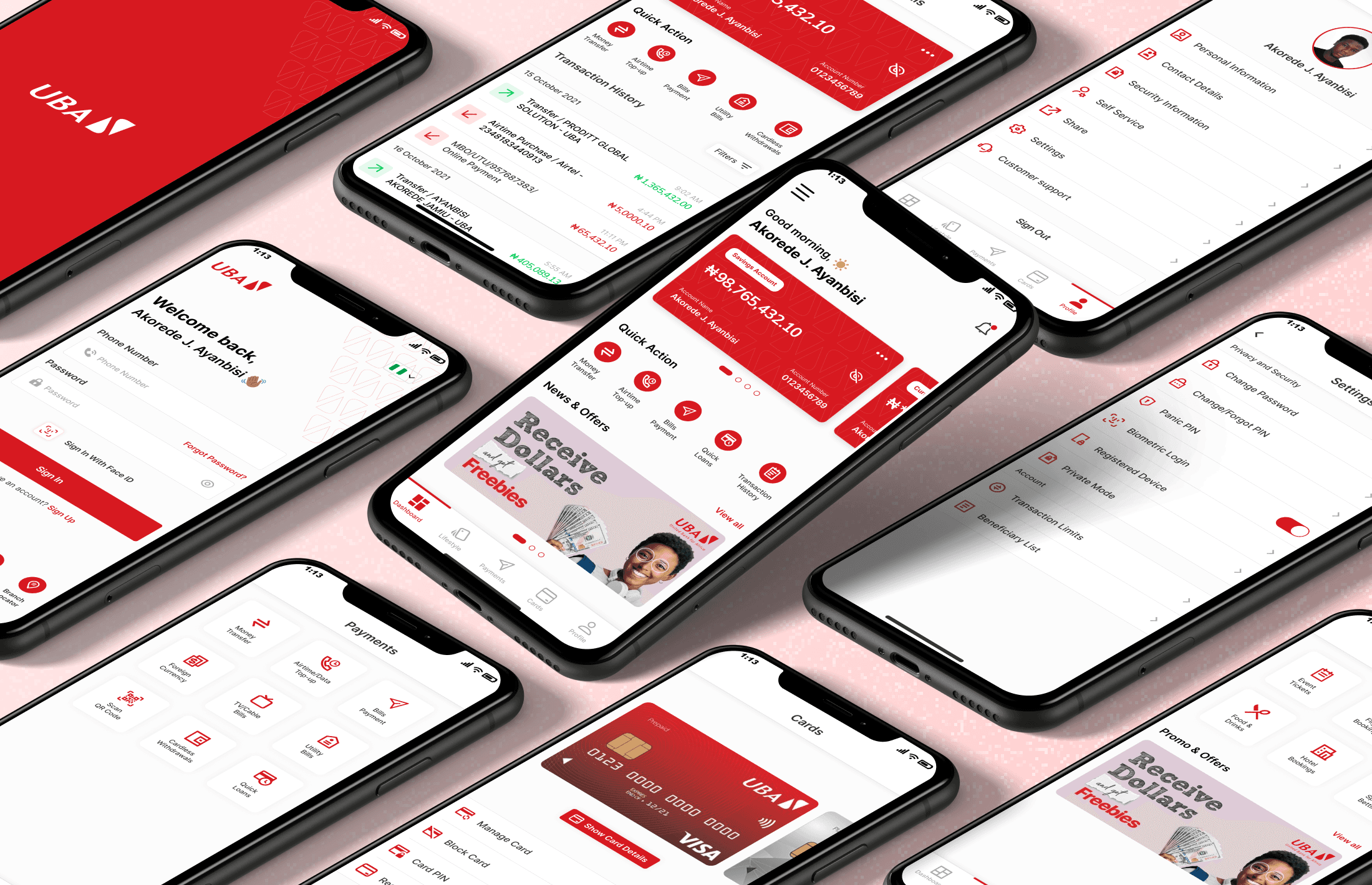
To redesign an easier and useable sign in, dashboard, account details, settings, cards, payments, profile, lifestyle, and navigation sidebar screen for new and existing users.
Also, to improve the overall UX of the UBA mobile banking app and design visually appealing user interfaces that can help users to achieve set goals while using the UBA mobile banking application.
The Problem
Identifying the problem
The problems uncovered were gotten from my personal experience, feedbacks from the mobile banking app reviews on app stores, and feedback from UBA customers who use the mobile banking app frequently. Feedbacks were gotten as a result of the user research which I carried out.
The problems identified are:
Unsatisfactory Sign In Experience
Untidy Dashboard and Poor Usability
Outdated User Interface (UI)
Bad User Experience (UX)
Below are screenshots of some bad reviews the existing app got on Google PlayStore and the Apple App Store.


1. Unsatisfactory Sign In Experience
Users find it hard to sign in smoothly without hiccups.

2. Untidy Dashboard and Poor Usability
The dashboard/homepage of the banking app is so bad and untidy; it also has poor usability.

3. Outdated User Interface (UI)
The interface of the app is outdated and isn’t user-friendly as it should be; it’s visually unappealing.

4. Bad User Experience (UX)
The mobile banking app isn’t seamless, it’s very clumsy to use and the hierarchy of information is a bit confusing for users.

The primary goal of good User Experience Design is “An interface that is usable and useful”. — Dr. Rosa I. Arriaga
The Process
The UX design process I used

Paper Sketch Wireframes
With the help of the UX research, reviews from the existing app and the survey carried out, I was able to sketch out the wireframes for the redesign of the mobile banking app which helped in getting the first visuals on paper.

Low-Fidelity Wireframes
After the paper sketch, I moved to Figma to experiment further and I was able to get even better visual directions for the redesign of the mobile banking app.

Usability Testing
Testing and Iterations
After creating the high fidelity wireframes, I decided to test the design solution with some users.
Introduction of quick actions
Users want to be able to carry out quick actions such as money transfers, airtime top-ups, opening UBA bank accounts, easy access to customer support, etc., without having to log in to their mobile banking app.

Visibility of account name and account number
Users want to easily access and clearly see their account name and account number on the card dashboard interface, making it convenient for them to reference their account details for various transactions or inquiries.

Simplified debit card request process
Users want the debit card request process to be simplified. Instead of physically visiting the bank branch, they prefer to request the card through the mobile banking app and have it delivered to their homes.

The Solution
The Solution To The Problem
1. Unsatisfactory Sign-In Experience
Looking at the redesign above, I have been able to simplify the sign-in issue with an easy and seamless experience.
Users will no longer experience difficulties and hiccups while trying to sign in. Users can also perform quick actions without fully signing in to the app.

2. Untidy Dashboard and Poor Usability
With my proposed dashboard redesign, I was able to tidy up and simplify the look and information needed to carry out a seamless banking transaction.
I also added a spot for news and offers in which users can stay updated and see at a glance.

3: Outdated User Interface (UI)
In order to proffer a solution to the outdated user interfaces of the existing app, I carefully designed clean, smooth, and usable user interfaces using the data I got from my UX research, reviews from the existing app, and feedbacks gotten from UBA customers who use the mobile banking app for their daily transactions.

4: Bad User Experience (UX)
Mere looking at the user interfaces of the existing app, we can all agree that the user experience will also be bad and unsatisfactory.
Like I said earlier, I’m a UBA customer and I use the mobile banking app at least 5 times daily to carry out transactions, and I must say that I get confused when I want to take certain actions on the app because the hierarchy information and arrangement of the app is not properly structured.
With my new redesigns, I was able to solve and tackle the issue of the bad user experience of the UBA mobile banking app.

External Links
External Links
Conclusions
Conclusions and Key takeaways
From the new processes that have been carried out and the new redesigns, it can be concluded that users can easily understand and interact with the new user interfaces.
Also, the new user experience of using the mobile banking app is very much easier, smooth, and useable unlike the previous user experience of the existing app. The information presented in the redesign will also help users to transact and carry out banking activities quickly without any delay or hiccups.
I am open to criticism and suggestions. I would also appreciate your feedback, honest reviews, questions, and your thoughts about this case study. I would be glad to reply.
Thank you for reading this case study and for your time. 😊
Other Projects
Here are some other best projects you can check out.